With printed marketing, you only get one chance to get it right. That’s why the design proofing process is so important. Sure, you can always make corrections and have it reprinted, but that can be very costly. Here, we’ll talk about what to look for and how to avoid mistakes and expensive reprints.
During the design and revision process, many changes are made. It’s always a good idea to keep track of those changes for when you’re ready to give final approval. It may sound tedious, but doing one final run-through to verify every change has been implemented is best. We always say, “whatever can happen, will happen in print,” just as a reminder to take that extra step in prevention.
Check it twice!
Our brain does this funny thing where it can comprehend text despite spelling errors and misplaced letters in the words, especially when you’ve read the same thing over and over. We recommend having a second pair of eyes to check for errors, especially when your project includes a lot of copy. As an added safeguard, we can also run spellcheck from within our design software.
What’s the difference between a soft proof and hard copy proof?
A soft copy proof is also known as a digital or electronic proof in PDF form. This is the most commonly used and most cost-effective process. The colors you see on screen can vary slightly, but again, unless exact colors are top priority, a digital proof is the way to go.
If you want to learn more about how colors can vary from screen to print, check out our blog: Why Colors Look Different on Screen vs When Printed
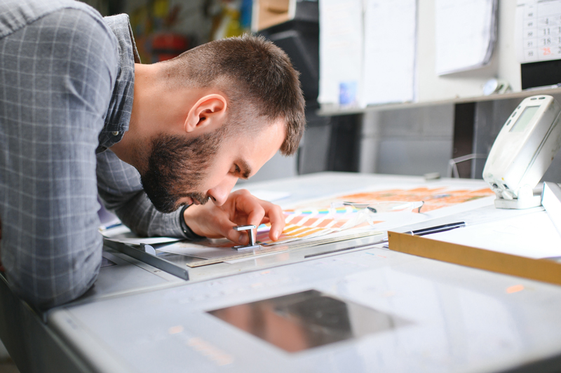
A hard copy proof is essentially is a physical copy of what your project will look like. If you have specific color requirements, this is the way to go. They typically take a few days to produce and are not trimmed and folded, but you will be able to verify colors and how they look on your chosen paper stock.
Proofing Checklist
Below are some important things to look for when reviewing your proof:
- Spelling errors
- Fonts – Do fonts appear as they should?
- Image clarity – If your pictures look blurry on screen, they are low-res and will look even more pixelated when printed. Check out Why Resolution for Printing is Critical if you want to learn more about how to ensure your printed images look great
- Alignment of images and text – Are all elements in the correct place and the proper orientation?
- Bleed/Trim – Do your graphics/images touch the edge of the page as intended? If you see white between the image and the edge of the paper, the answer is no. Is your text with the safe area so it won’t accidentally be cut off?
- Page sequence – If you’re printing a booklet or brochure, checking page order is crucial
- Folding or perforations – Are the folds or perforations indicated in the correct place and not too close to text blocks?
Just remember, the proof is your last opportunity to make corrections, so be sure to review it carefully. Once all looks OK, the rest is up to the printer.
The design proofing process can be overwhelming, especially when you’re managing it all on your own. Let us help! We have extensive experience and can guide you through the whole process. Whether you’re looking for new print materials or have questions about anything print-related, please don’t hesitate to reach out!
