When it comes to your brand, colors are extremely important. Understanding how colors are translated on everything from business cards to digital billboards is crucial. Here, we will discuss the difference between RGB and CMYK and how you can preserve your brand’s color identity across all forms of media.
What is the difference between CMYK and RGB?
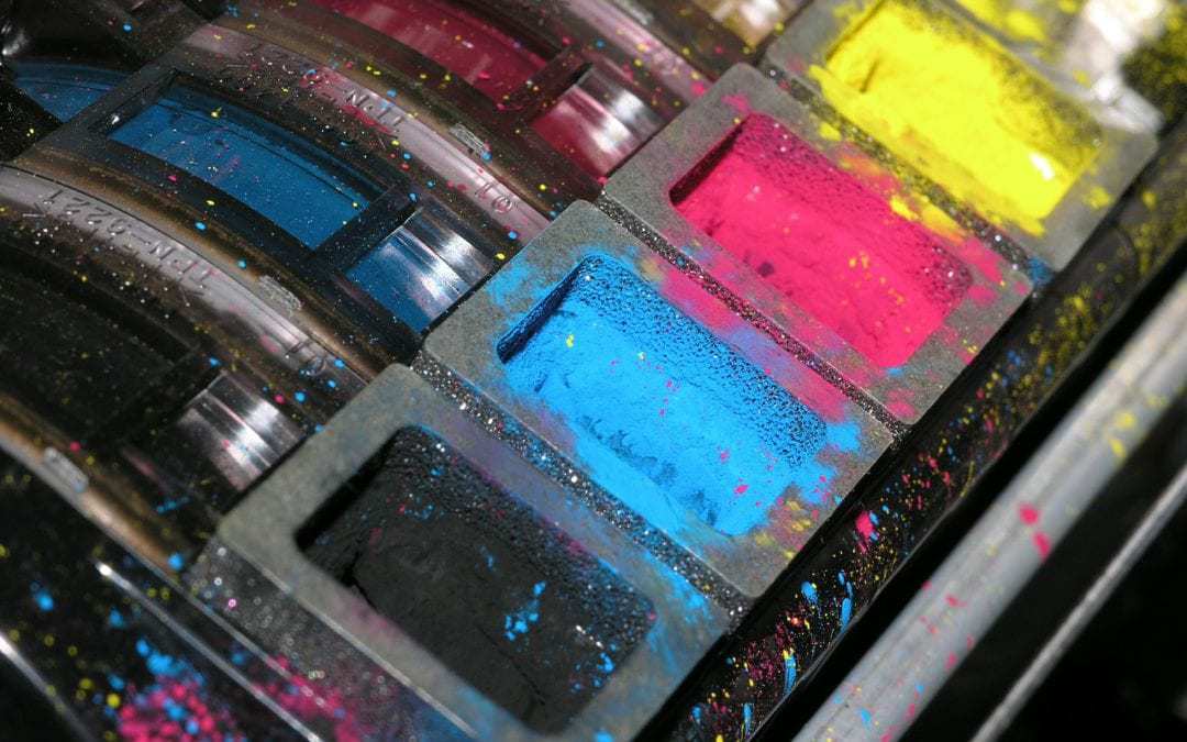
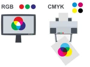 First, let’s start with the difference between the colors displayed on digital and printed items. Printer ink is composed of 4 basic colors; cyan, magenta, yellow and black (CMYK). Computer monitors, mobile phones and other digital displays are composed of 3 basic colors; red, green and blue (RGB).
Remember, knowing how you are going to present your marketing material is important to determine up front so it’s designed in the proper color mode.
How do I know which color mode to choose?
Since your business cards, flyers, brochures, etc. are intended to be printed, they should be designed using the CMYK color settings. That includes the CMYK version of your logo, images and any other elements used in the design.
Items that are designed to be displayed digitally, like your website, social media graphics or even digital billboards should be designed using the RGB color settings.
Microsoft Word, Powerpoint, Keynote are programs intended for digital use and don’t allow you to adjust settings like these. This is why we always recommend using professional design programs like Adobe InDesign, Photoshop and Illustrator. These programs are especially important if you intend to use a professional printer versus printing at home – which we always recommend! See why here: Professional Printer vs Desktop Printer
What happens when you print something intended for digital display?
Let’s say you want to print one of your social media graphics intended for Facebook. Since they were designed for RGB, translating them to CMYK will result in the color not appearing as bright on paper as it is on screen. This is because CMYK can only print 70% of the colors that are available in RGB. While most modern desktop printers are supposed to handle the CMYK to RGB conversion for you, they’re not always accurate.
The same rule applies when viewing items intended for print on your computer screen: Since they were designed using CMYK color settings, displaying them in RGB will change the appearance of the colors.
Below is a great example of how an image in RGB mode will print in CMYK.

While both images still look great, as you can see, the CMYK side is missing some deep vibrance. This is a great example of the color loss/change that can happen when your images are not converted to CMYK before printing. If it’s important that it prints like the original, converting it to CMYK is a must!
Why do my colors look so much brighter on screen than when printed?
This might sound obvious, but it’s not always something people think about before considering the reason. It’s simple: all digital displays have light behind them. If you look at any color on your computer screen and adjust the brightness, you will see the intensity of the color change before your eyes.
The color of the paper stock also comes into play. For instance, say your main brand color is a vivid yellow and you want to ensure it comes out that way on your business cards. If you choose a beige paper stock, your yellow will be much more muted than if printed on a bright white stock. Think of the bright white stock as your computer screen at 100% brightness and the beige paper as 0% brightness.
It seems like everyone has a computer that makes it easy to dabble in some sort of design these days. The colors you choose are straightforward and will translate to mobile phones, tablets and even television. However, when it comes to printing your design, it can get a bit tedious and overwhelming. That is why we are here.
If you ever have any questions about colors and how to make sure your brand stays consistent across all sorts of media, don’t hesitate to reach out. We’re happy to help. Reach out!